THE ENVIRONMENT AGENCY. Agency: Storycatchers Helping the Environment Agency tell a clearer more confident story.
Skills used: creative strategy, narrative framing, brand development, visual design, photography direction, content planning, stakeholder collaboration
Outcomes:
Gave teams a clear, consistent way to explain their work
Helped staff challenge misconceptions with confidence
Enabled non-designers to create accurate, on-message materials
Built a stronger foundation for future campaigns and storytelling

Creative Strategy and Direction
We began by understanding how frontline staff talked about their work and how the organisation represented itself through existing materials. This revealed a few common issues:
audiences rarely understood the Agency’s role, responsibilities or limitations
internal content varied widely in tone and design
mixed and reactive messaging made it harder for staff to push back against misinformation
photography and visuals often didn’t reflect real work or conditions in a helpful way
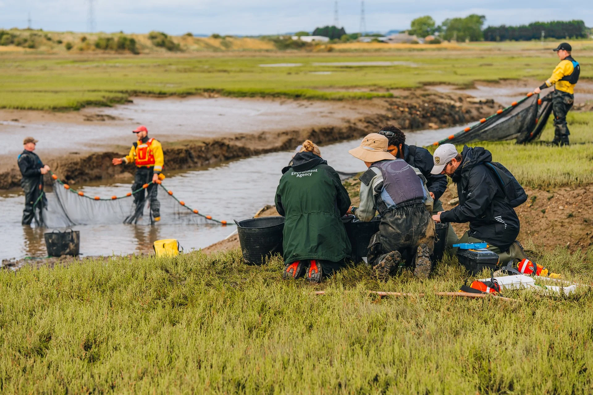
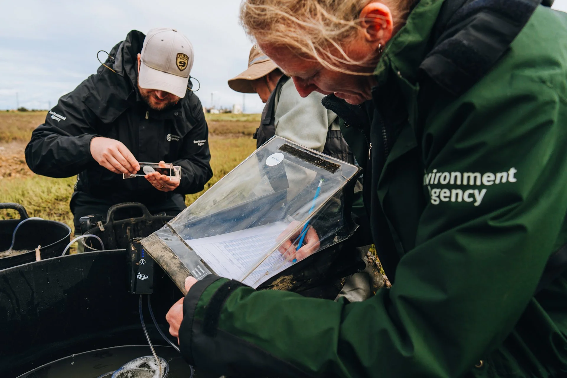
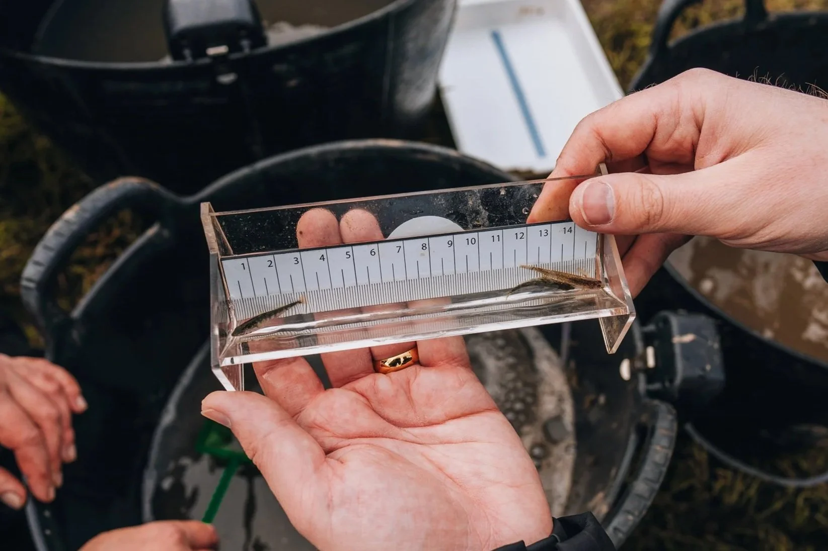
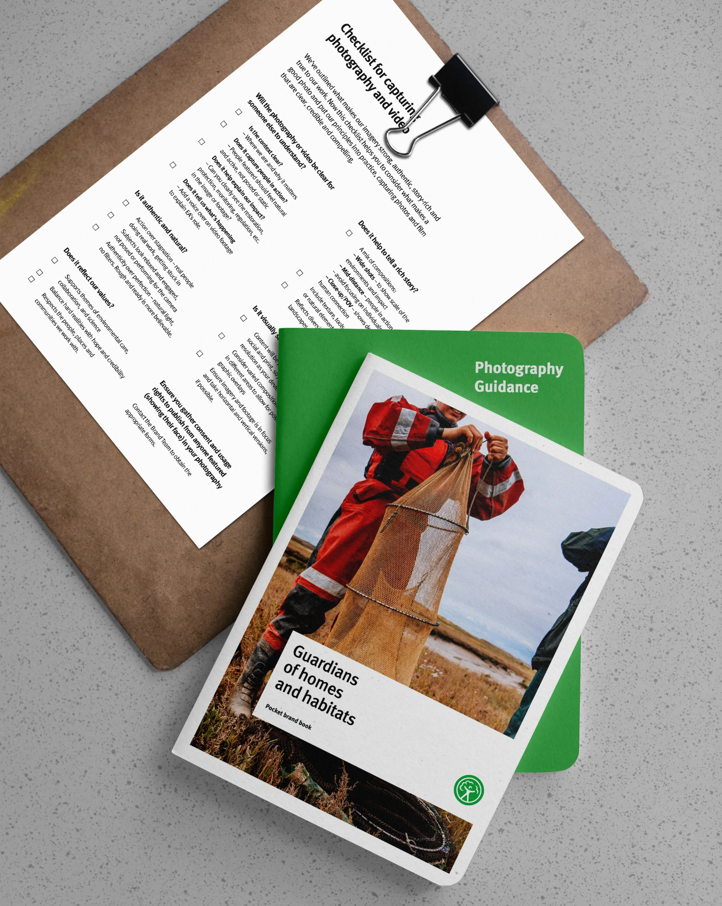
To address this, we developed a set of clear photographic principles that gave the work a stronger, more honest identity. These acted as a simple guide for how imagery should look and feel across the Environment Agency.
authenticity over perfection – show real people doing real work in real conditions, because truth builds credibility
action over stagnation – focus on activity, purpose and progress rather than posed or polished imagery that feels engineered
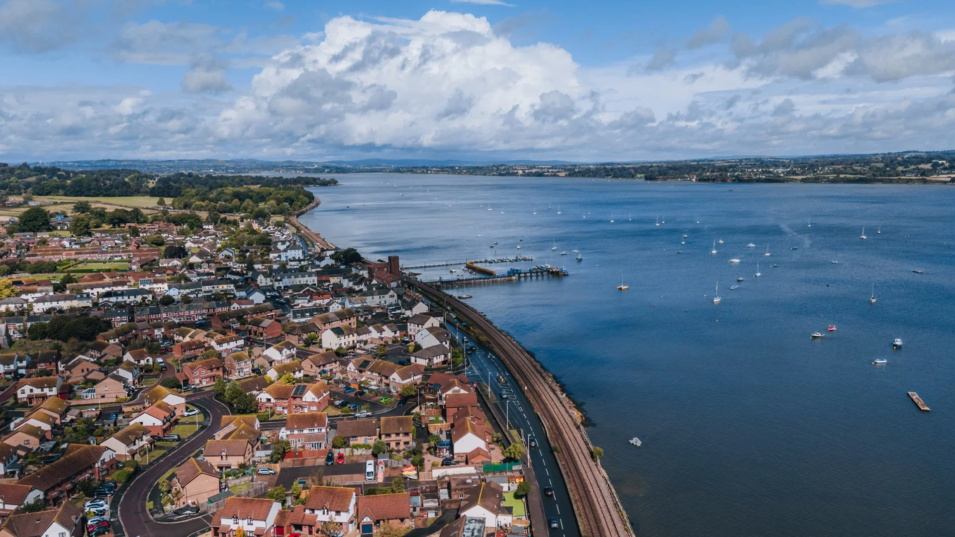
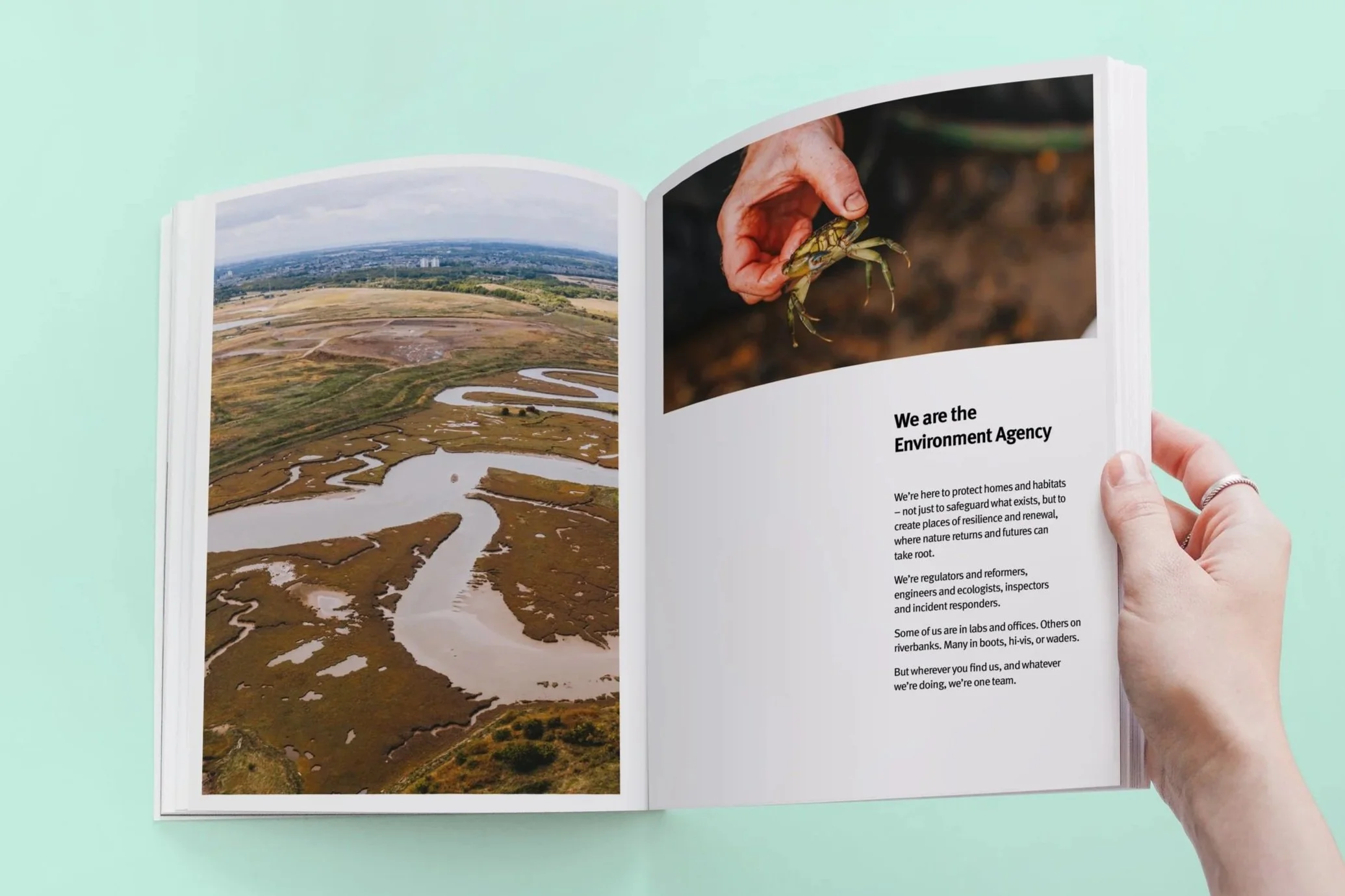
micro, mid and macro – combine close-up details, mid-range action shots and wide landscapes to show the care, the action and the scale of the work
balance – represent environmental challenges alongside optimism and recovery
reportage, not corporate – use a documentary tone that feels human, relatable and true
These principles gave the Agency a practical, repeatable way to show its impact and helped teams move away from generic stock images towards something that felt active, respectful and real.
Context
The Environment Agency needed a clearer and more consistent identity that would help its teams speak with confidence about the organisation’s work. Under constant pressure from the public and media, the Agency’s comms often became inconsistent, reactive and hard for people to understand. My role was to help create a grounded narrative and a practical visual identity that staff could use day to day, regardless of location, role or comms experience.
The project was about giving people within the Agency tools that helped them tell their story with clarity, confidence and honesty.


Empowering internal teams
A major part of the project was making sure people across the Agency could use the new narrative tone and photographic approach in their day-to-day work. Many teams operate in remote locations with limited time, limited tools and no formal design support, so the guidance had to be simple, realistic and genuinely helpful.
We created practical templates, photography guides and clear examples of how to apply the principles in different situations. The aim was to help staff document the work they were proud of, correct misconceptions when they arose and explain the Agency’s impact in a way that felt honest and consistent.
By giving teams easy-to-use tools rather than rigid rules, the work made it simpler for non-designers to create materials they felt confident sharing. It also supported a more joined-up visual language across regions, reducing the need for constant central oversight.
The visual work sat alongside a clearer narrative that focused on the real environmental work happening every day across the country. We shifted the emphasis away from abstract policy language and towards the people, places and decisions that define the Agency’s impact. This helped the identity feel more human and more connected to the realities staff deal with.
The refreshed narrative and photographic principles supported each other. The visuals showed the truth of the work, and the words explained why it mattered. Together they created a more joined-up way for the Environment Agency to talk about itself, whether the audience was internal teams, partners or the public.
By giving staff a simple, consistent framework to work from, the identity became easier to apply across regions and roles. It also created a stronger base for future campaigns, internal engagement and public storytelling.
The Brand Book
To bring everything together, we created a beautifully designed brand book that captures the tone, vision and visual standards of the refreshed identity.
The book showcases the new photography style in action and demonstrates best practice for how the Agency can visually express its purpose, from flood management and biodiversity restoration to lab analysis and community collaboration.
It celebrates the often unseen work that the Environment Agency carries out every day and gives staff the tools and inspiration to share those stories with confidence and consistency.
Outcome
The work gave the Environment Agency a clearer and more usable identity that strengthened how teams present their work both internally and externally. Staff gained a consistent way to explain what they do, challenge misconceptions and highlight the positive impact they deliver across communities and the environment.
It also made it easier for non-designers to create accurate, on-message materials, improving consistency across regions without adding pressure to central teams. Overall, the project helped build more pride in the Agency’s purpose and created a stronger foundation for future campaigns, internal engagement and public storytelling.